Wednesday, 11 September 2013

Low Budget ideas (2)

Low Budget ideas (2)

The second low budget video i analysed was Imogen Heap- A-ha.
The video starts off in black and white with the silhouette of a girl crouching down in what seems to be a forest. The way that this is shot makes the girl seem very animalistic, which straight away gives the music a mysterious feel. The fact that it's shot in black and white creates a dark, creepy and sinister atmosphere from the very outset of the video. This does not seem very conventional of a music video, as there is no colour, 
Shortly after, we are shown an extreme close up of half of the girl's face, with her eye bright open and her pupil dilated. This gives the impression that she is feeling fear. Again, there is no colour, just black and white, which maintains the mystery and sinister tone of the video. The girl is staring directly into the camera, which makes the audience feel edgy and uneasy.

The next scene shows presumably the same girl with her hands tied together, symbolising that she is being restrained by someone. This suggests that she needs to be held captive for some reason, yet creating more mystery and suspense. Also, what's more noticeable is that colour has been introduced to the video, but still with a black background. This stands out to the audience, signifying that there is an element of importance to the specific scene. 
Here is another extreme close-up of the girl's face. However, this time only her mouth is being shown. What's weird about this image is that her skin is still colourless but her lips are an abnormally bright red colour. This again is mysterious and also arguably unconventional of a music video, as they are usually fully in colour or shot in black,white and grey.
However, what is conventional is that there is a performance element to the video. For example, there are various shots of the girls dancing (shot in colour this time) as well as black and white shots of a pair of hands (again with bright red nails) playing the piano. This means that the artist is at least appearing in the video. Overall, whilst there are a few conventions of a music video being shown throughout the video, many of the shots and the actual content of the video are unconventional. However, the music video is very intriguing yet entertaining at the same time, meaning it is in the end a good example of a low budget music video.

Tuesday, 10 September 2013

Mood Board


A similarity between all of these shots from the soft rock genre is that they all show the artist/band performing.

Monday, 9 September 2013

Theory 1 (Vernallis)

Low Budget ideas (1)

Low Budget Ideas (1)

To gain a better understanding of how we can make an effective music video without spending a hefty sum of money on products, I decided to watch an example of a low budget music video made by other A level students. This one was called The Fix- Just got Paid. 
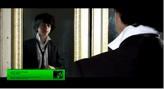
Firstly, this music video  uses many of the typical conventions found in a pop music video. As you can see, video starts with the band in a studio with only lights at the back illuminating them. This means that already the artists are being introduced, thus meaning already one of the conventions is being followed. Also, as soon as the lights come on, the song starts, meaning the song is the soundtrack to the whole video. As well as this, once the lights are up, the boys do a few dance moves whilst harmonizing. This shows the performance from the band members. 
As you can see from these two shorts, the music video quickly individually introduces the band members, whilst slightly adding a concept to the video; the concept seeming to be the boys dressing up smart to go out, possibly because they just got paid- which would be an effective link to the song. After introducing the members individually, there is a shot of them all together. Also, what's noticeable here is that they are all wearing a different attire than they were when the lights were coming on at the start. This shows that they have thought about changing the costume to fit the location when they change that too. 

Again, the costume and location change is evident here. However, what becomes more apparent here is the guy (presumably the 'lead' singer) is lip-syncing along to the song here. As you can see from the first image of him, they have used a close-up of the boy to show him lip-syncing the words. This is then followed up by a mid-shot. 
This is a shot from the closing moments of the video. As you can see from all of the images, a lot of different camera shots and angles have been used. This creates a slick, flowing music video that stays entertaining to watch. Also, again here you can see the performance side of the video, where the boys are all dancing in time to one another. Overall, I think that this shows many conventions of an actual real pop music video. Therefore, I believe that this is a very good example of a low budget music video.

Sunday, 8 September 2013

Analysis of a Rock Video (2)

Analysis of a rock video (2)

The second rock song I chose to analyse was The White Stripes- Seven Nation Army, as it is arguably one of the most recognized rock songs.
The music video starts like this, and as soon as the video starts, the song starts. The song plays throughout the entire video, as the song is the soundtrack to the music video. This is one of the conventions of a music video.
Another convention present is the presence of the band throughout the whole video. As well as this, the band members play their respective instruments throughout the entirety of the song. The singer can be seen lip-syncing a few times throughout the video too. This has all been done to show that the focus of the video is the band.
However, there is essentially no other conventions of a music video throughout the rest of the song. The entire video is shot using diamond shapes getting closer and closer (as seen from the Tubechop below)
 
The whole video is shot like this, meaning that there is no location change, costume change, and certainly no narrative or concept present in the video. Therefore, I would argue that this video is not a very conventional rock music video.

Analysis of a Rock video (1)

Analysis of Pop video (2)

Analysis of Pop video (2)
The second pop video i analysed was Britney Spears - baby One More Time. the reason for this is that it is very stereoypical of the pop genre, and the music video to the song has many conventions of a music video in it.

Immediately here, the artist has appeared in the video, to show that is is their song. Also, the setting instantly informs the viewer that their is some kind of narrative throughout the video (being school kids). Also, this is a close-up, letting you know that she is the main subject in this video. 
here, the artist is appearing again, this time lip syncing along to the song. This shot is another close-up, which has been used to try and make the artist look seductive. Again, the concept of the video is displayed here, being high school kids having fun when the teachers aren't around. Also, there is a location change here.
here, you can see that the artist is performing in the video, both with singing and dancing. Also, a mid-shot has been used to show the performance part of the video. As well as this, the performance sections have been intercut with the narrative parts of the song. Again, there is a location change. Also, the editing of this shot cut to the beat, making the editing flow with the song.
Here, you can clearly see both the location change, as well as the costume change to match the new location. Again, the artist is both dancing and lip-syncing along to the lyrics of the song. A mid/long shot has been used again to show the performance throughout the video.
Although not noticeable through just screengrabs, other conventions of this music video include the song being the soundtrack to the whole video, at least three locations and costume changes, and the use of slow-motion editing at one point to create a majestic, sexy feel to the video. Overall, it can be validly argued that this music video is a very conventional music video.